
Project: American Quarter Horse Association (AQHA)
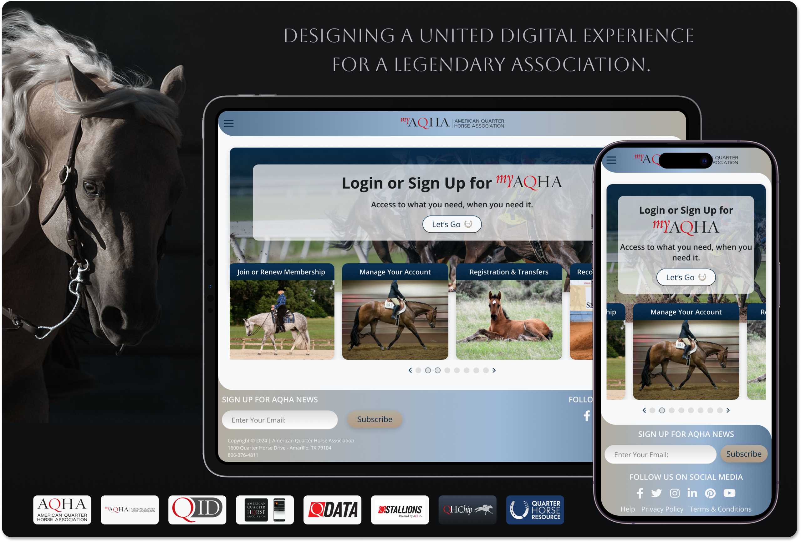
Designing a more cohesive digital experience for AQHA ~ modernizing a complex member portal, navigating a fragmented digital ecosystem, and establishing the design foundations for a more connected future.
ENGAGEMENT:
- Oct 2022 – Sep 2026
PRIMARY PRODUCTS:
- MyAQHA Member Portal
- Certificate Manager
- Quarter Horse Resource
- QHChip Racetrack App
- AQHA Rulebook App
CONTRIBUTIONS:
- Product Design, UX/UI Design, Tokenization
- Interaction & Complex Workflow Design
- Information Architecture
- Prototyping & Front End Pre-development
- Design Leadership & Cross-Functional Collaboration
01. Project Overview
ENTERPRISE PRODUCT DESIGN · UX STRATEGY · DESIGN SYSTEMS
The American Quarter Horse Association (AQHA) serves a diverse international community of horse owners, breeders, competitors, industry professionals, and enthusiasts. Supporting that community requires more than a public-facing website. It involves an extensive network of digital properties, authenticated member services, registration processes, record-management tools, and specialized industry applications.
I joined AQHA as a contract UX/UI designer with a primary focus on modernizing MyAQHA, the organization’s authenticated member portal.

Over nearly four years, my responsibilities extended into related digital products, enterprise design consistency, complex transactional workflows, and the development of a scalable design foundation.
What began as a focused portal-design engagement evolved into an opportunity to examine how interconnected experiences could become more intuitive, consistent, and sustainable across the organization. Multiple AQHA digital products had evolved across different platforms, teams, and business requirements, creating inconsistent interaction patterns and fragmented user experiences.
The challenge was not simply to modernize individual screens. It was to understand how members navigated a complex organization, identify where design decisions could reduce friction, and establish more coherent patterns without disrupting the familiarity or functionality users already depended upon.
02. Understanding the Enterprise Ecosystem
DISCOVERY · ECOSYSTEM EVALUATION · USER CONTEXT
Although MyAQHA was the primary focus of my engagement, I began by taking a broader view of AQHA’s digital presence. The organization operated numerous interconnected web properties, each serving different audiences and business needs. Members could move between public websites, authenticated portals, pedigree databases, event resources, registration services, and other specialized applications throughout a single relationship with AQHA.
It was a priority to understand not only how these properties looked and functioned independently, but how they collectively shaped a user’s perception of the organization. My initial exploration focused on identifying the connections and inconsistencies across AQHA’s broader digital ecosystem.
- Fragmented digital properties:
- Different platforms and application histories contributed to inconsistent navigation, layouts, visual treatments, and interaction conventions.
- Limited enterprise-wide design standardization:
- Without a unified design system governing the broader product family, individual applications had developed their own interface patterns and visual approaches.
- An exceptionally broad user demographic:
- AQHA served everyone from youth participants to elderly members, including a substantial older audience. Stakeholder requirements emphasized legibility, larger base typography, stronger contrast, and familiar interface conventions.
- Complex information relationships:
- Member accounts, horse ownership, registration records, participation programs, and specialized services introduced layers of interconnected information that needed to be understood before redesigning individual experiences.
One of the more important considerations was recognizing that visual modernization and usability were not interchangeable.
For an organization serving such a wide age range, established patterns and recognizable conventions could be valuable. A more contemporary interface would not necessarily be more successful if it introduced unnecessary learning demands or reduced readability.
This informed my approach to typography, visual hierarchy, interaction patterns, navigation, and responsive behavior. Rather than treating modernization as a purely aesthetic exercise, I considered how design changes could preserve familiarity while making information and actions easier to understand.
This broader evaluation also revealed opportunities to establish consistency beyond MyAQHA. Shared design decisions around typography, spacing, components, form behavior, navigation, and responsive layouts could provide a more cohesive foundation for products that had historically evolved independently.
These observations would later inform my work on reusable design components and the larger Design Operating System.
03. Designing the MyAQHA Member Experience
CORE PRODUCT · INFORMATION ARCHITECTURE · WORKFLOW DESIGN
MyAQHA was the central focus of my engagement and the most substantial area of my design work. As AQHA’s authenticated member portal, it provided access to services ranging from account and horse-record management to registrations, breeding documentation, membership activities, and other specialized transactions.
Unlike a conventional content-driven website, MyAQHA needed to support users completing detailed, sometimes highly conditional tasks involving multiple records, relationships, eligibility requirements, and procedural steps. My responsibility was to organize these experiences into interfaces that could accommodate that complexity without making the underlying processes unnecessarily difficult to navigate.
3.1 Establishing the information architecture
A major part of the design process involved determining how different types of content and functionality should be presented. Not every service belonged in the same interface pattern. Some required straightforward access to a single page, while others depended on grouped information, changing account conditions, or multi-step transactions.
I approached these differences through three broad structural categories.
- 01 – Standalone content and services
- Direct-access pages for focused tasks, reference information, or account-management functions where users needed a clear destination and an understandable set of actions.
- 02 – Grouped and conditional content
- Tabbed sections, categorized dashboards, and state-dependent interfaces that organized related information without overwhelming users with everything at once.
- 03 – Guided transactional workflows
- Multi-step forms and process-driven experiences that broke complicated transactions into manageable sequences with clearer progress, validation, and review.
This distinction helped establish a more consistent design rationale across the portal: selecting an interface pattern based on the structure of the task rather than forcing unrelated services into a single presentation model.
3.2 Designing meaningful content groupings
The MyAQHA dashboard organized major services into four primary categories: My Account, My Work, My Horses, and My Activities.
These groupings helped users discover services according to the kinds of information they wanted to access or actions they intended to perform. However, the more interesting design challenges often appeared deeper within the application.
- Account and payment management
- Related account functions, such as saved payment methods, needed to be organized into recognizable groups that made individual records and available actions understandable.
- Horseback riding program participation
- The riding program introduced multiple dimensions of information that could not be represented effectively through a single undifferentiated list.
- Horse records needed to distinguish registered American Quarter Horses from non-registered, grade, or other-breed horses. Rider information also needed to account for differences between established participants and individuals who had not yet initiated program enrollment.
These conditions influenced how content was grouped, which actions were available, and what information users needed at each stage. The design challenge was to make these relationships visible without making the interface feel more complicated than necessary.
3.3 Simplifying complex processes through guided workflows
Some of MyAQHA’s most important services required users to complete specialized transactions with multiple stages, conditional inputs, and record-dependent information. For these experiences, I developed reusable workflow patterns designed to support sequential task completion.
Examples included:
- Online Registration: guiding users through the information and requirements involved in registering a horse.
- Stallion Breeding Reports: structuring a complex reporting process into an understandable series of steps.
- Breeder Certificate Release: organizing a specialized certificate-related transaction.
- Certificate Manager: exploring how selected certificate-management functions, including temporary assignments to racetracks, trainers, auction houses, or breeding lessees, could use guided transaction patterns.
Across these workflows, I focused on establishing predictable progress indicators, consistent form behavior, understandable grouping of required information, and appropriate opportunities for review and correction. The objective was not to eliminate the procedural complexity inherent in AQHA’s services, but to reduce the amount of complexity users needed to manage at any one moment.
3.4 Evolving Digital Certificates into Certificate Manager
One of the more significant product initiatives involved the evolution of a Digital Certificates concept into functionality integrated within MyAQHA. The initial exploration considered how horse ownership and registration documentation could be accessed and managed through a more modern digital experience.
As stakeholder direction and product requirements evolved, the work was adapted to align with MyAQHA’s established branding, navigation, and broader service architecture.
This required reconciling an ambitious design direction with the practical constraints of an existing enterprise application.
FEATURE EVOLUTION: Initial Concept → Interactive Prototype → MyAQHA Integration
The Digital Certificates work also provided an opportunity to communicate a proposed product direction beyond the immediate development team.
An interactive concept was presented at the 2024 AQHA Convention, creating an opportunity for attendees to experience and respond to the proposed functionality.
This became a meaningful point in the project’s evolution, connecting product exploration with direct exposure to members and stakeholders.
The resulting design work illustrates an important aspect of enterprise product design: a compelling standalone concept must ultimately be evaluated against established product structures, business priorities, implementation constraints, and user expectations.
3.5 Working within real-world constraints
Throughout the engagement, design decisions needed to accommodate established platforms, existing business logic, stakeholder requirements, and development considerations. Not every proposed enhancement could be implemented exactly as designed, and some more ambitious improvements remained outside the scope of the immediate development work.
My role required balancing the desired user experience with those constraints, preparing design artifacts for development, and maintaining a clear distinction between current functionality, approved direction, and proposed enhancements.
This was particularly important when developing reusable patterns intended to support consistency across multiple services.
The MyAQHA work demonstrates my ability to translate complex enterprise processes into structured, usable interfaces while balancing business requirements, technical realities, and a diverse member audience.
04. Extending Design Across AQHA’s Digital Products
RESPONSIVE DESIGN · PRODUCT-SPECIFIC UX · CROSS-PLATFORM CONSISTENCY
While MyAQHA remained the primary engagement, I also contributed to several associated digital initiatives with distinct interaction challenges. These projects expanded my understanding of AQHA’s broader ecosystem and reinforced the importance of selecting design solutions appropriate to each product’s audience, content, and technical constraints.
Quarter Horse Resource — Responsive Pedigree Tables
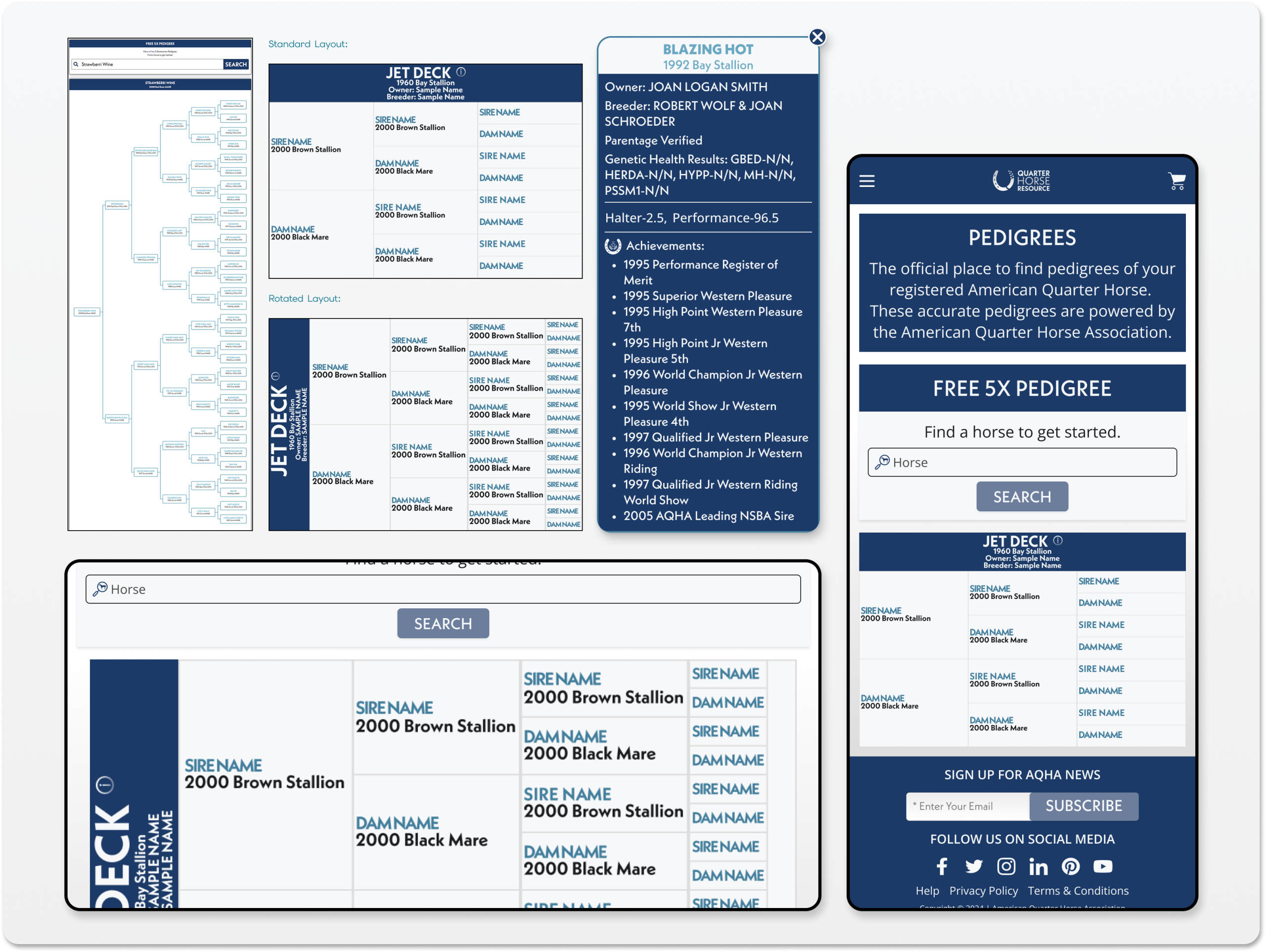
- Pedigree tables presented an unusual responsive design challenge. Unlike standard data tables, pedigrees visualize nested ancestry relationships across generations. Their structure is inherently wide, and the information hierarchy depends on preserving visible relationships between parent and descendant records.
- Simply stacking columns or reducing the table to fit smaller screens risks undermining the very relationships the visualization needs to communicate.
- My work on the Quarter Horse Resource pedigree experience explored how to improve responsiveness while preserving the clarity and integrity of the ancestral structure. This required treating the pedigree as a specialized information visualization rather than a conventional table.
AQHA Youth Quiz — Designing for a Different Generation
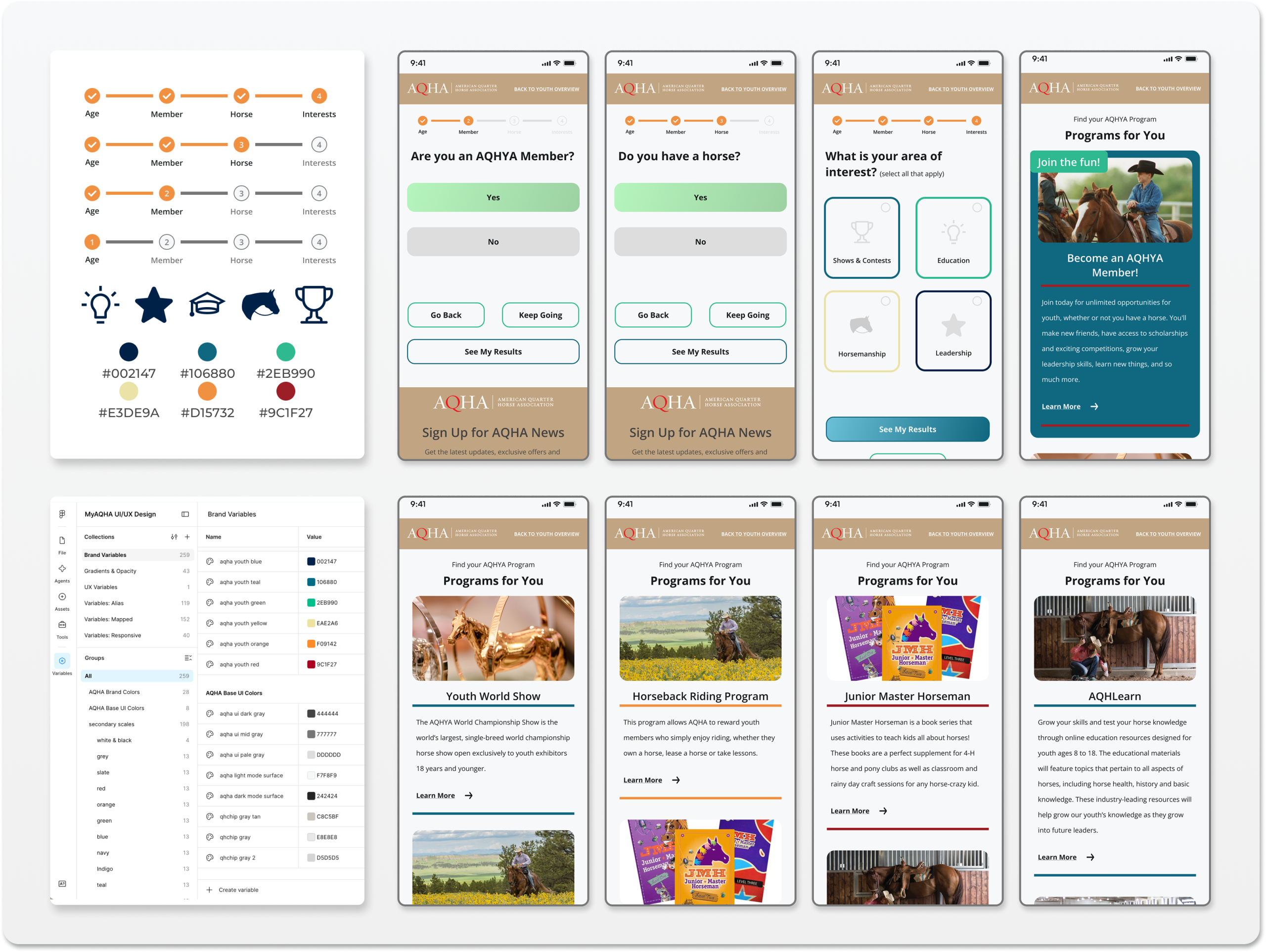
- The Youth Quiz introduced a different kind of challenge: creating an engaging experience for a younger audience within an organization whose established brand language primarily reflected its broader membership.
- Stakeholders wanted the experience to feel more relevant and visually appealing to youth participants, even if that required departing from AQHA’s existing color palette.
- This created an opportunity to explore a more expressive visual direction while retaining fundamental usability principles and a recognizable relationship to the organization. The project demonstrated that design consistency does not always require identical visual treatments. Sometimes, audience relevance calls for a deliberately differentiated expression of the brand.
Cross-product collaboration
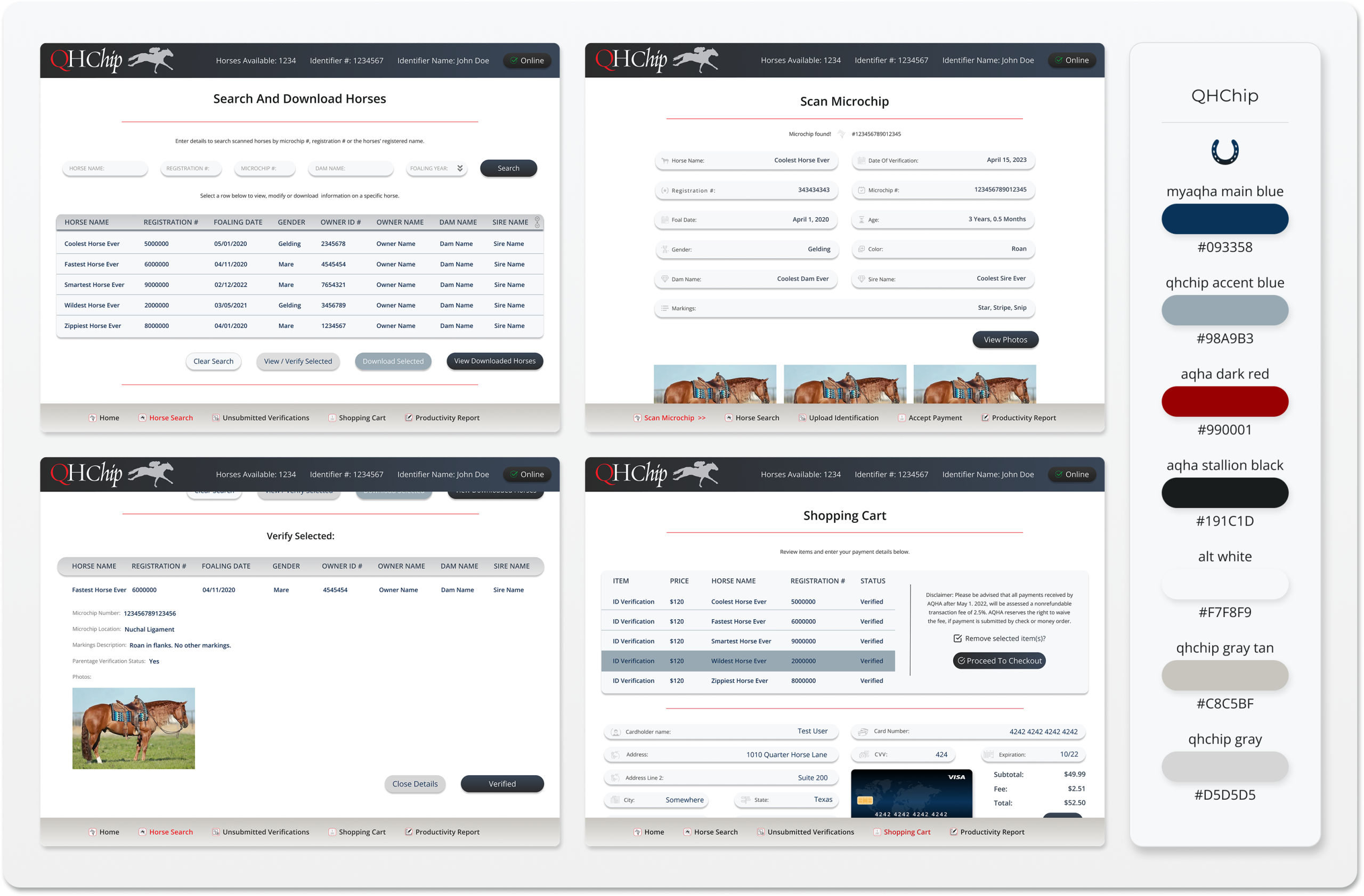
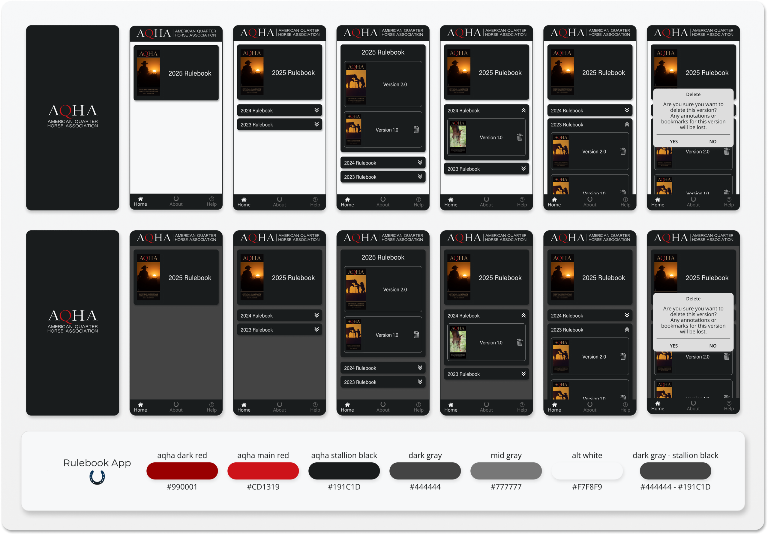
- Additional contributions across AQHA’s digital ecosystem, including work associated with the QHChip (racehorse microchips) iPad app, the AQHA Rulebook (competitions) mobile app, along with other website properties, presented additional opportunities to apply consistent interface principles to products with different purposes and content structures, across different technical environments and product teams.
- Together, these projects reinforced a broader design philosophy: reusable standards should create consistency where it benefits users, while allowing specialized products the flexibility to solve their own problems.
- These efforts required practical collaboration, attention to implementation requirements, and an understanding of how design decisions made in one application could inform others.
- Design takeaway: A mature enterprise design approach needs both standardization and flexibility. The goal is not to make every product look identical, but to establish a consistent level of usability, quality, and coherence.
05. Building the Foundation for AQHA’s Next Design Evolution
DESIGN SYSTEMS · TOKEN ARCHITECTURE · FUTURE-STATE PRODUCT DESIGN
During the final months of my engagement, I focused on consolidating and expanding the design foundations developed throughout the project. After working across MyAQHA and related applications, I had a clearer understanding of the patterns that could be shared, the exceptions that needed to be supported, and the areas where AQHA’s digital products could benefit from a more systematic approach.
This work evolved beyond a traditional visual style guide into a proposed Design Operating System: a structured foundation intended to connect visual standards, reusable components, interaction patterns, responsive behavior, and future product development.
Designing for consistency and extensibility
The operating system brought together foundations such as typography, color, spacing, layout, and responsive conventions, alongside reusable UI components and more complex application patterns. It also created an opportunity to document how individual design decisions related to broader enterprise needs.
Design Operating System
Design Foundations:
Color · Typography · Spacing · Layout · Tokens
Reusable Components & Patterns:
Navigation · Forms · Tables · Tabs · Steppers · States
Product-Level Experiences:
MyAQHA · Certificate Manager · Supporting Applications
Future Design Evolution:
More cohesive, scalable, and maintainable digital experiences
Exploring the next generation of AQHA interfaces
Alongside system consolidation, I developed future-state interface concepts exploring how AQHA’s digital experiences could evolve beyond existing implementation constraints.
These explorations provided an opportunity to revisit visual hierarchy, navigation, responsive layouts, interaction behavior, and cross-product consistency from a more comprehensive perspective.
Rather than representing a completed production redesign, this work established a proposed direction for future enhancements and a more unified digital experience.
The intention was to leave behind more than a collection of completed screens: a coherent set of design assets and architectural thinking that could support future product decisions.
What this engagement reinforced
My work with AQHA strengthened my understanding of the relationship between enterprise UX strategy, product design, implementation realities, and long-term design-system thinking. It reinforced that complex digital experiences rarely improve through isolated visual changes. Meaningful progress requires understanding the larger environment, the people using the products, the business processes behind them, and the systems that connect individual experiences.
Across nearly four years, my contributions ranged from evaluating a fragmented enterprise ecosystem to designing detailed member workflows, addressing specialized product challenges, and developing a proposed foundation for AQHA’s next phase of digital evolution.
The defining thread throughout the engagement was the pursuit of coherence: making complex services more understandable, disconnected experiences more consistent, and future design decisions more intentional.