
Revised Logo & Alternates >>

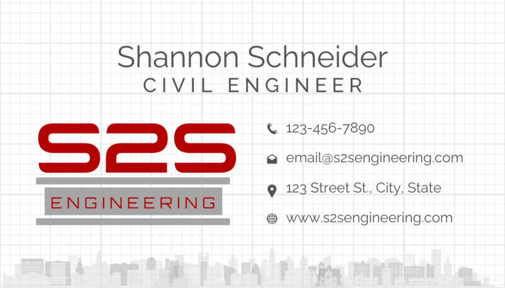
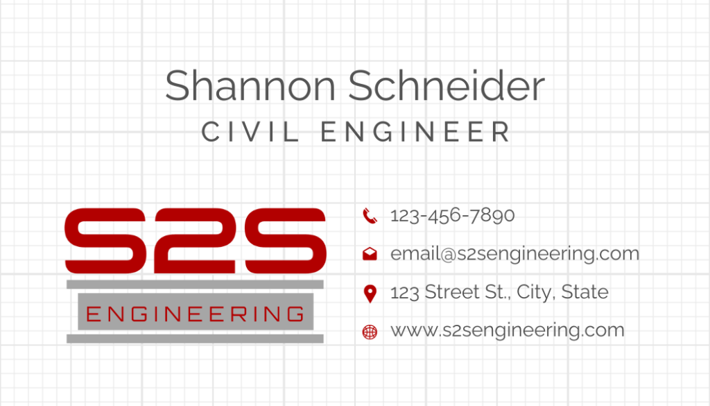
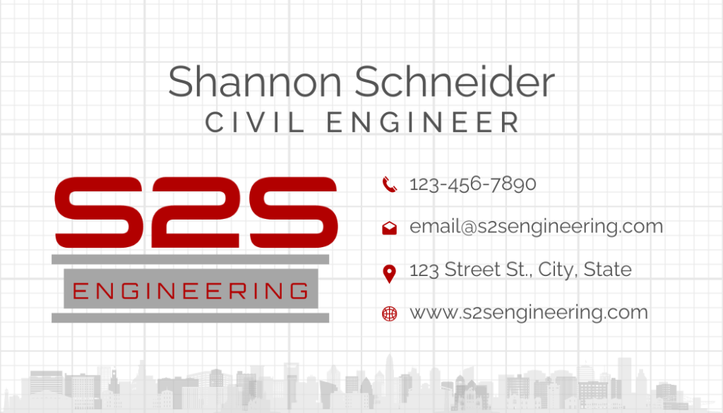
Using white text is best suited for dark backgrounds, so I’ve added a gray background & gray border around the Engineering text of the first image (so it can be seen on this page’s white background). For printing on paper products, the red shadow or solid red text are options, or for some products like business cards, you may also consider having the white text embossed. I’ve added a linear i-beam as another option for some of these, which allows the white text to be seen.
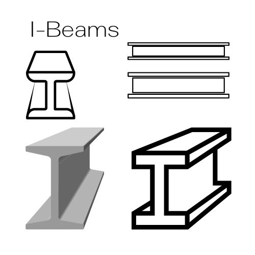
The gray linear i-beam is the better option for this type of logo layout, but I’ve added additional graphics below the business card drafts in case you’d like to try another i-beam layout. I’m not sure the one I’ve used here will be recognized as an i-beam to anyone outside your industry.

#1
#2
#3

#4

#5
#6

#7

#8
#9
Business Card Fronts >>
#1
#2
Business Card Backs >>
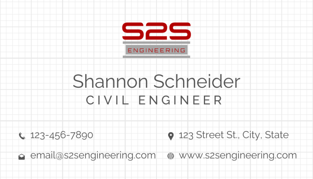
#1
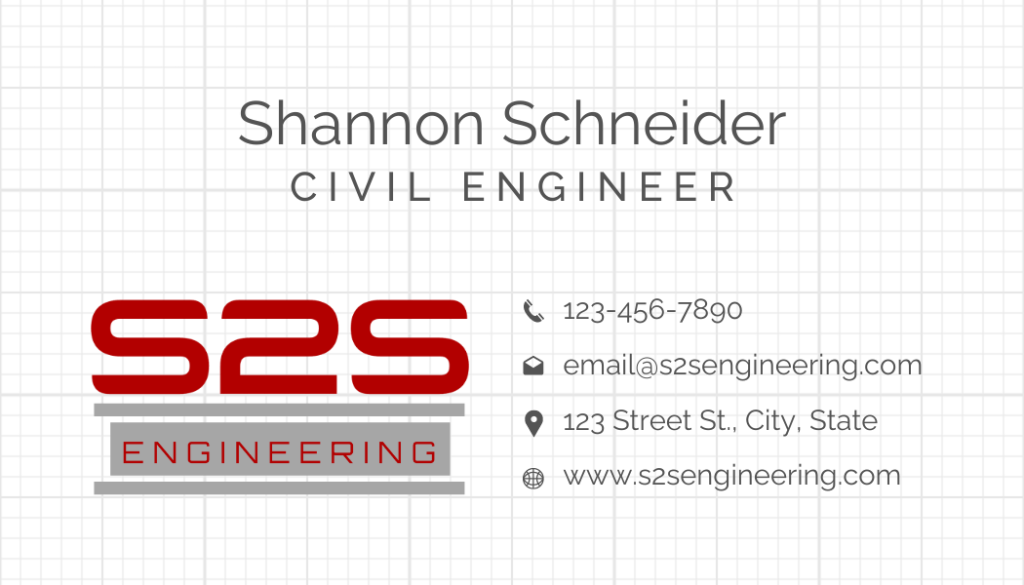
#3
#5

#2
#4
#6
I-Beam graphic alternatives:
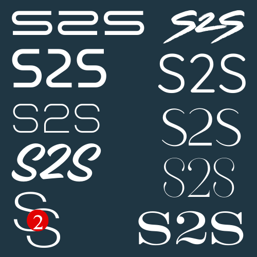
Font Sampling

#1

#2

#3

#4

#5

#6

#7

#8
#9

#10

#11

#12

#13

#14

#15

#16
#17

#18
#19
#20