
Project Overview:
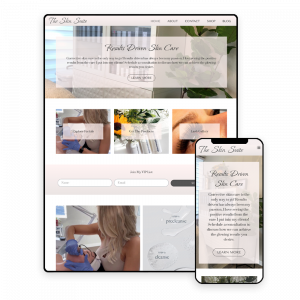
The client is a service provider who has reached scheduling capacity and has branched out into associated e-commerce offerings. She sought a design that balances and enhances the imagery utilized for her portfolio in a way that doesn’t appear bland or clinical, but still evokes an element of expertise.
User experience research was conducted, and an elegant, brand-aligned interface was designed, along with cohesive social media and email marketing assets for promotion of her new product line.
Scope:
Goals:
Process:
Research & Discovery:
Information Architecture:
Aesthetic:
The client had previously invested in professional branding and quality photography, so the color palette was only altered to increase visibility of the paler pink colors to improve visibility on bright backgrounds. Gradients are featured throughout the design for accents, buttons and alternating background sections.
Colors:

Colors: #FFF4F3 | #EBE4E3 | #333333 | #555555
Considerations:
Elegant fonts and linear icons were selected for a clean, uncluttered impression.
A “handwritten” styled accent font was included to elevate the overall appearance, but was used sparingly to maintain a minimalist style.
Iconography:
Typography:
Bonheur Royale:
The Skin Suite
Tenor Sans:
Prata:
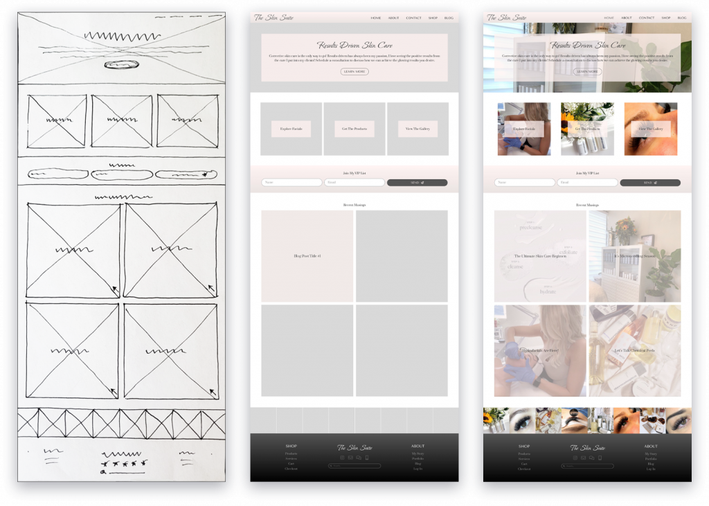
Wireframes:

Thank you for viewing this project.